Boricua Restaurant Branding
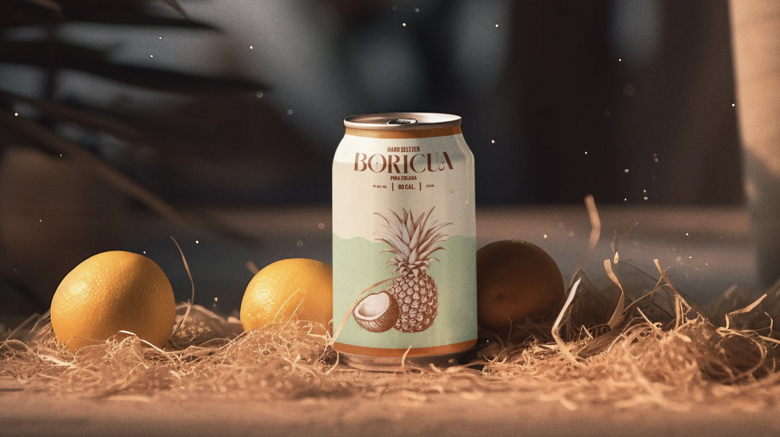
Boricua is more than just a restaurant brand; it's a heartfelt tribute to the rich culinary heritage of Puerto Rico, inspired by the authentic home cooking of my grandmother. The brand concept revolves around the essence of being Boricua, a term that resonates deeply with Puerto Rican identity, encapsulating the pride and cultural richness of the island's people. The chosen color palette for Boricua is deliberately vibrant, mirroring the tropical landscape and spirited culture of Puerto Rico. These colors not only bring the brand to life but also evoke a sense of welcoming and festivity that is intrinsic to borinquen gatherings. A distinctive element in my branding is the use of coconuts. They are not just a staple in the island's cuisine, they are often seen as symbols of tropical abundance and are integral to the island’s natural landscape. The familial love of my grandmother's kitchen to everyone who dines with us, makes Boricua more than a name; it's an invitation to experience the soul of Puerto Rico through flavors that have been passed down through generations.